
Education data analytics services are transforming how we understand and improve educational outcomes. Yet, raw data is overwhelming. That’s where Power BI & Tableau for Education Data Visualization becomes indispensable. These tools convert complex datasets into clear, actionable insights, empowering educators, administrators, and policymakers to make informed decisions. This guide delves into the essentials of Power BI & Tableau for Education Data Visualization, comparing their features and providing practical steps to leverage these platforms for impactful educational analysis.
Table of Contents
Introduction to Power BI and Tableau: Your Data Storytellers
Data is the backbone of informed decision-making. Power BI and Tableau are the powerful tools that transform raw data into compelling, visually engaging narratives. They offer educators and administrators a clear, data-driven perspective on school performance, resource allocation, and student progress.
While both serve the purpose of Power BI & Tableau for Education Data Visualization, they cater to distinct user needs. Power BI integrates seamlessly with the Microsoft ecosystem, while Tableau excels in creating highly customizable, aesthetically pleasing visualizations.
A Strategic Choice for Education Data Analytics Services
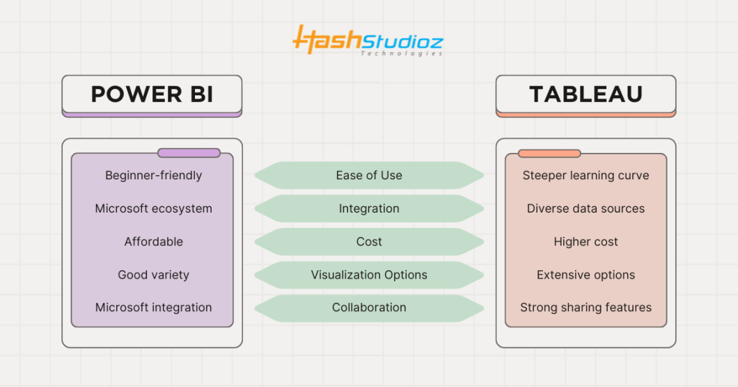
1. Power BI: The Microsoft Powerhouse for Education Data Visualization
- Strengths:
- Seamless integration with Microsoft Excel, Office 365, and Azure.
- Intuitive drag-and-drop interface and straightforward visualizations.
- Cost-effective, making it ideal for budget-conscious educational institutions.
- User Interface:
- Familiar interface for Excel users, simplifying the learning curve.
- Efficient for quick data analysis and reporting.
- Best for:
- Educational institutions are already invested in the Microsoft ecosystem.
- Organizations seeking affordable, easy-to-implement data visualization solutions.
2. Tableau: The Visualization Champion for Education Data Analytics Services
- Strengths:
- Superior visualization capabilities, enabling the creation of interactive, data-rich dashboards.
- Highly customizable graphics and robust data modeling.
- User-friendly drag-and-drop interface for complex data analysis.
- User Interface:
- Visually appealing and highly customizable workspace.
- Powerful tools for creating compelling data stories.
- Best for:
- Educational institutions prioritizing advanced data visualization and interactive dashboards.
- Organizations require flexibility to handle complex data models.
The Indispensable Role of Data Visualization in Education Data Analytics Services
Education data analytics services generate vast amounts of information. Transforming this data into visual insights is crucial. Graphs, charts, and heatmaps reveal patterns and trends that inform strategic decisions and optimize educational practices.
For example, a school district can use a dashboard to analyze student performance trends, identify areas needing improvement, and allocate resources effectively. This is the power of Power BI & Tableau for Education Data Visualization.
Getting Started: Implementing Power BI & Tableau for Education Data Visualization
Software Installation:
- Download Power BI from the official website (free or pro version).
- Download a Tableau Desktop trial or use Tableau Public for free.
Data Source Connection:
- Connect to diverse data sources (CSV, databases, cloud services).
- Import student performance, enrollment, and budget data.
Interface Navigation:
- Power BI: Ribbon-style menus and drag-and-drop features.
- Tableau: Flexible workspace for dynamic visualizations.
Crafting Interactive Dashboards and Reports for Education Data Analytics Services
Visualization Design:
- Use appropriate data visualization graphs elements (pie charts, bar graphs, scatter plots) to convey data effectively.
- Tailor visualizations to the audience (educators, administrators).
Interactive Dashboard Creation:
- Incorporate filters, drill-downs, and tooltips for interactive data exploration.
- Enable users to analyze data based on specific demographics.
Advanced Feature Utilization:
- Calculated fields: Create custom metrics and trends.
- Data modeling: Link data sources for comprehensive analysis.
Collaborative Sharing of Education Data Analytics Services Visualizations
Power BI:
- Integrate with Microsoft Teams and SharePoint.
- Publish reports to Power BI Service for real-time updates.
Tableau:
- Share dashboards via Tableau Server and Tableau Online.
- Securely host and distribute visualizations.
Best Practices for Education Data Visualization
- Simplicity: Focus on essential data points. Avoid overloading your dashboard with unnecessary information.
- Storytelling: Create logical, data-driven narratives. Make sure your visualizations flow logically, guiding the user through the information in a way that leads to actionable insights.
- Audience Awareness: Tailor visualizations to specific user needs and level of understanding of your audience. Teachers, principals, and policymakers all have different goals and data needs.
- Strategic Color Usage: Highlight key data with consistent color schemes. Stick to a consistent color scheme and use it to highlight key data.
Power BI Vs Tableau: A Comparative Overview for Education Data Analytics Services
Essential Tools for Power BI and Tableau in Education: Empowering Data-Driven Decisions
To effectively utilize Power BI and Tableau in Education, certain tools are indispensable for transforming raw data into actionable insights. Here’s a breakdown of key functionalities within both platforms, specifically tailored for Power BI and Tableau in Education:
Tools in Power BI
- Power Query: Efficiently clean and prepare diverse education datasets for analysis, ensuring data accuracy and consistency.
- DAX (Data Analysis Expressions): Create custom calculations and metrics specific to education, such as student performance averages or resource utilization rates.
- Power BI Service: Enable seamless sharing and collaboration on reports and dashboards across educational departments and districts.
Tools in Tableau
- Tableau Prep: Streamline data preparation by cleaning and shaping education data before analysis, saving valuable time.
- Calculated Fields: Derive new insights by creating custom data fields from existing data, allowing for deeper analysis of educational trends.
- Tableau Online: Securely share and collaborate on visualizations and dashboards, facilitating data-driven discussions among educators and stakeholders.
Transform Education Data into Actionable Insights with HashStudioz Technologies Inc.
HashStudioz empowers educational institutions to master Power BI & Tableau for Education Data Visualization. We provide tailored analytics services, enabling you to visualize data effectively, derive key insights, and enhance decision-making.
Tailored Analytics Services:
- Customized Solutions: We deliver analytics solutions precisely aligned with your institution’s goals.
- Seamless Data Integration: We integrate diverse data sources (student databases, LMS) into Power BI and Tableau for a unified view.
Custom Dashboard Design:
- Interactive Dashboards: We create user-friendly dashboards highlighting critical educational KPIs.
- Data-Driven Storytelling: We use advanced visualization to simplify complex data narratives.
Advanced Analytics Strategies:
- Predictive Insights: We implement predictive analytics to identify student trends and support at-risk students proactively.
- Informed Decision Making: Our strategies empower leaders to make data-backed decisions.
Training and Support:
- User Training: We provide comprehensive training to maximize your team’s proficiency with Power BI and Tableau.
- Continuous Support: We offer ongoing technical support to ensure optimal tool performance.
Collaboration and Secure Sharing:
- Team Collaboration: We facilitate seamless insight sharing across departments.
- Secure Data Sharing: We ensure data privacy compliance for secure access to visualizations.
Best Practices Implementation:
- Expert Guidance: We advise on data visualization best practices to enhance effectiveness.
- Continuous Refinement: We focus on ongoing dashboard and report optimization.
Partner with HashStudioz Technologies Inc. to leverage Power BI & Tableau for Education Data Visualization, driving student success and institutional improvement.

Conclusion: Empowering Education with Data Visualization
Power BI & Tableau for Education Data Visualization empowers educators and administrators to make data-driven decisions. By transforming raw data into visual insights, these platforms enhance understanding and drive positive change. Incorporate these tools into your workflow to unlock the full potential of Education data analytics services.
Incorporating data visualization tools like Power BI and Tableau into your educational workflow will empower you to present complex information in a clear, concise, and compelling way. Whether you’re just starting out or you’re already an experienced data professional, these tools can help you enhance learning outcomes and create a brighter future for education.
So, go ahead—unleash your inner data wizard and start creating meaningful visualizations that will transform education data into impactful insights!