Data plays a central role in decision-making across various fields, from business to education. However, raw data on its own can be difficult to digest or interpret. Data visualization is the key to transforming complex datasets into clear, actionable insights. Whether you’re a seasoned data analyst or just getting started, knowing which graph types to use can significantly impact the effectiveness of your presentation. In this article, we will explore different types of data visualization graph types and guide you on how to choose the best one for your specific data. By the end, you’ll have a deeper understanding of various graph types and be equipped to select the most suitable one for your analysis.
Table of Contents
Why Data Visualization Matters
Before diving into the specific types of graphs, it’s important to understand why data visualization is so critical. Humans are wired to process visual information faster than text or numbers alone. Data visualization helps to:
- Simplify complex data: It makes the data more accessible to a broader audience.
- Enhance understanding: It helps uncover patterns, trends, and outliers.
- Improve retention: People are more likely to remember data presented in visual formats.
- Enable quicker decision-making: Visual data leads to faster interpretation, helping to make informed decisions in real time.
By leveraging Data Visualization Consulting Services, businesses can ensure that their data is not only presented effectively but also aligned with their goals. Consultants help tailor visualizations to communicate key insights in the most impactful and accessible way, enhancing decision-making and driving business success.
Now, let’s explore the most commonly used data visualization graph types.
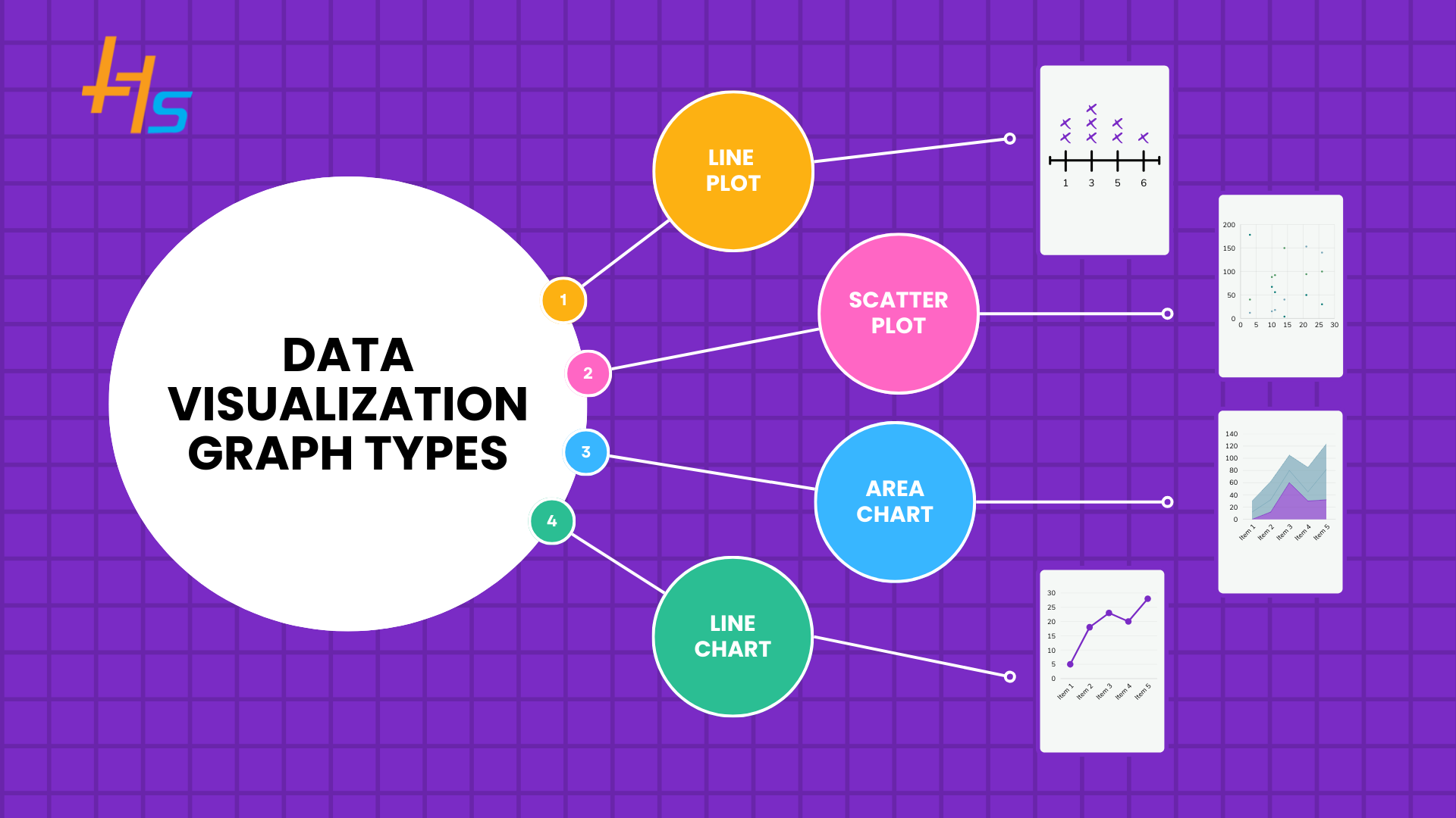
Overview of 14 Popular Data Visualization Graph Types
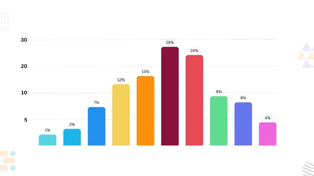
1. Bar Charts
Bar charts are one of the most widely used data visualization tools, perfect for comparing categorical data. In a bar chart, categories are represented by bars of different lengths or heights. The length or height of each bar reflects the value of the category it represents.
When to Use Bar Graph
- Comparison of categories: Ideal for comparing multiple categories, such as sales by region or performance across different months.
- Discrete data: Best for data that can be divided into distinct categories.
Example Bar Graph
- Sales revenue comparison between different products.
- Population across different cities.
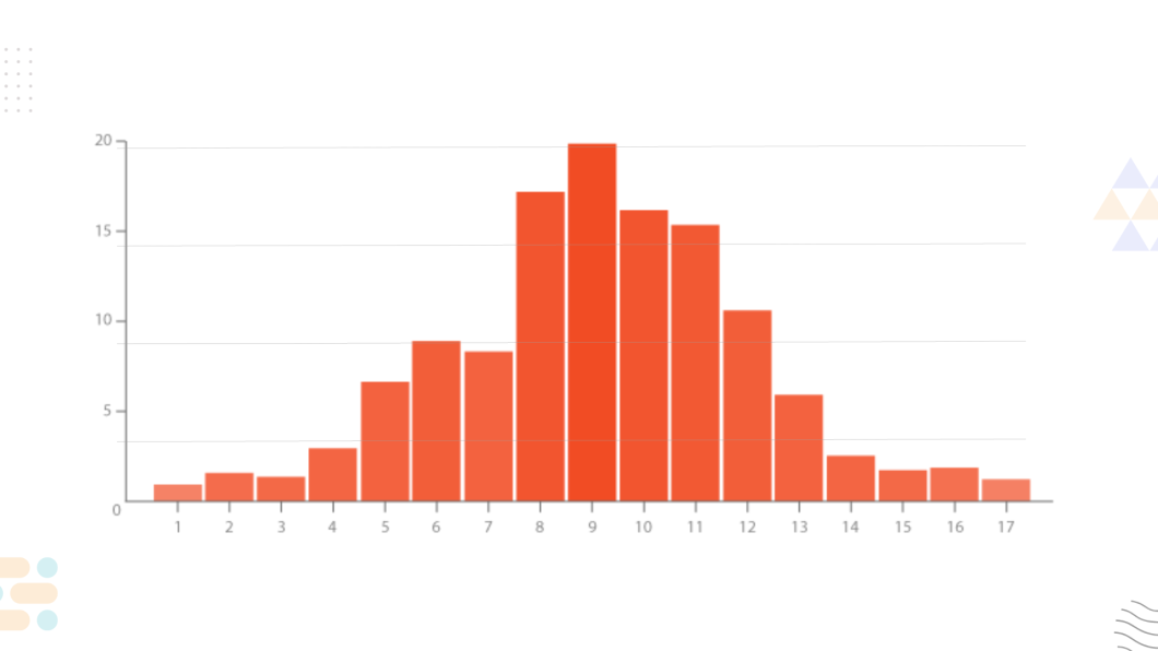
2. Histograms
Histograms are similar to bar charts but are specifically used for showing the distribution of continuous data. They group data into ranges (bins) and display the frequency of values within those ranges.
When to Use Histograms
- Distribution of continuous data: To show the distribution and frequency of data points within specified ranges.
- Identifying data skewness: Helpful in identifying trends like normal distribution or skewness.
Example Histograms
- Distribution of exam scores for a class.
- Frequency of customer purchase amounts.
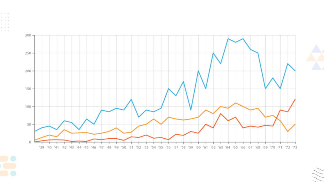
3. Line Graphs
Line graphs are used to display data points over time, making them particularly useful for time series analysis. They show trends, patterns, and changes over a period.
When to Use Line Graphs
- Time-based data: Ideal for showing how values change over time, such as stock prices, website traffic, or sales figures.
- Trend analysis: Great for identifying upward or downward trends.
Example Line Graphs
- Stock market trends over the last year.
- Website traffic over several months.
4. Pie Charts
Pie charts show parts of a whole, with each “slice” representing a category’s proportion of the total. While they are visually appealing, they are most effective when there are only a few categories.
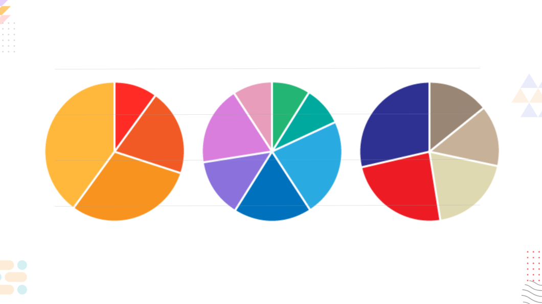
When to Use Pie Charts
- Proportional data: When you want to show how different categories make up a whole, like market share or survey responses.
- Limited categories: Best used when you have a small number of categories (3-5).
Example Pie Charts
- Market share of different smartphone brands.
- Proportion of respondents in a survey.
Also Read:- Top Data Visualization Tools to Watch in 2025
5. Scatter Plots
Scatter plots display the relationship between two continuous variables by plotting individual data points on a grid. The pattern of the points can show correlations between the variables.
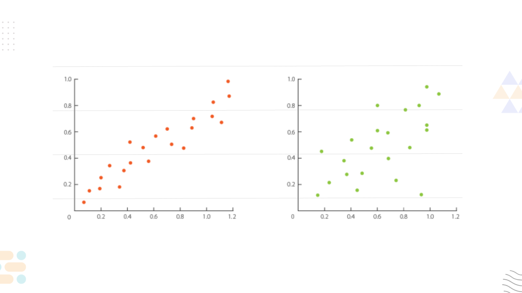
When to Use Scatter Plots
- Identifying correlations: To identify potential relationships between two variables, such as height vs. weight or income vs. education level.
- Outlier detection: Scatter plots can help identify data points that deviate from the norm.
Example Scatter Plots
- Relationship between advertising budget and sales.
- Correlation between age and income.
6. Bubble Charts
A bubble chart is an extension of the scatter plot where a third variable is represented by the size of the bubbles. This allows you to visualize three dimensions of data in a single chart.
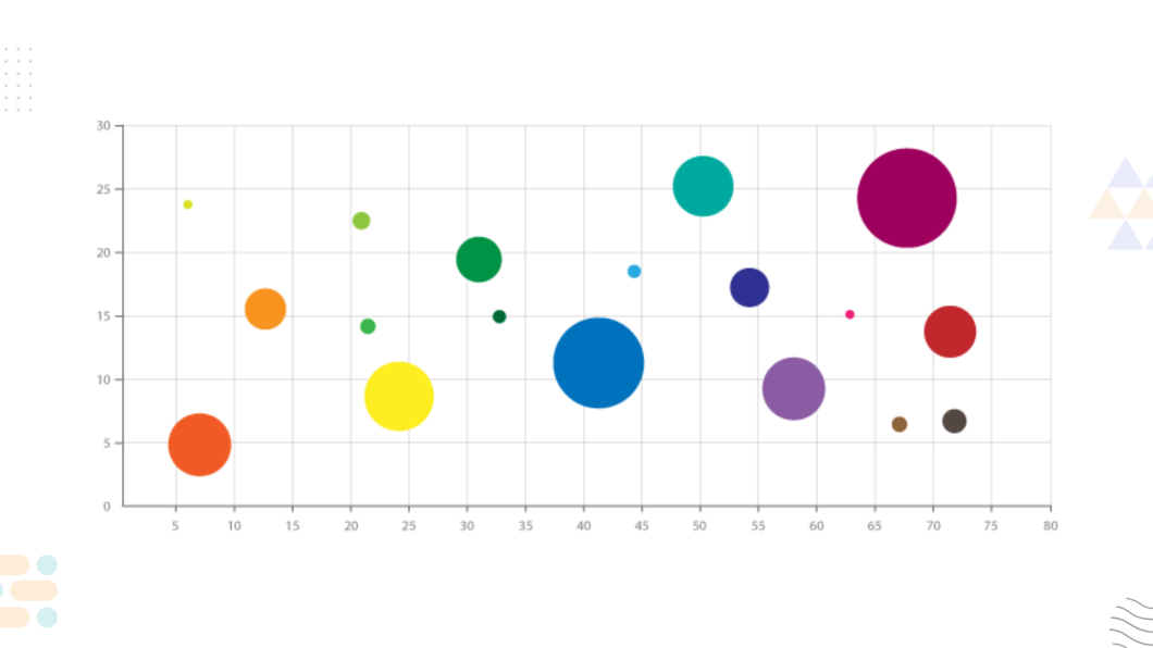
When to Use Bubble Charts
- Three-dimensional relationships: When you need to show how three variables interact.
- Analyzing clusters: Useful for identifying clusters or groups of data points.
Example Bubble Charts
- Sales performance by region, with bubble size representing market potential.
- Population, GDP, and life expectancy by country.
7. Heat Maps
Heat maps use color to represent values in a matrix or table, where each color corresponds to a range of values. These are excellent for visualizing patterns and trends across large datasets.
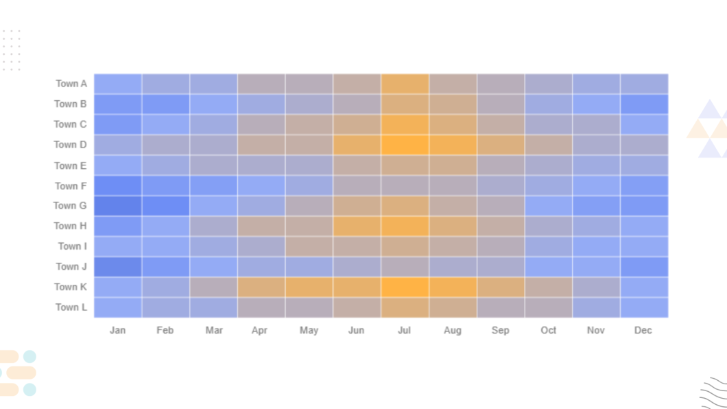
When to Use Heat Maps
- Spotting trends in large datasets: Ideal for detecting patterns and correlations in complex data sets.
- Identifying areas of focus: Often used to highlight high and low values in areas like sales performance or website activity.
Example Heat Maps
- Website traffic by time of day and day of the week.
- Performance metrics across multiple regions.
8. Area Charts
Area charts are similar to line graphs but with the area below the line filled in. They are useful for showing cumulative totals over time and visualizing the magnitude of change.

When to Use Area Charts
- Cumulative data: When you need to show the sum of values over time.
- Multiple data series: Useful when comparing multiple datasets or categories.
Example Area Charts
- Cumulative sales over the course of a year.
- Comparison of revenue growth from multiple departments.
9. Stacked Bar Charts
Stacked bar charts are used to display the breakdown of a total by category within each bar. They are helpful when you want to compare part-to-whole relationships across multiple categories.
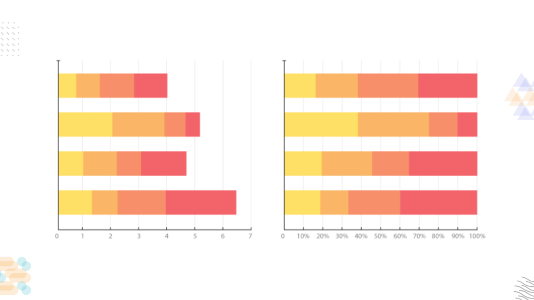
When to Use Stacked Bar Charts
- Part-to-whole comparisons: When showing how individual categories contribute to a total across different groups.
- Multiple categories: When you need to compare several datasets at once.
Example Stacked Bar Charts
- Monthly sales figures broken down by product type.
- Budget allocation across different departments.
10. Treemaps
Treemaps are used for displaying hierarchical data using nested rectangles. Each branch of the hierarchy is represented by a colored rectangle, with the size of the rectangle corresponding to a particular value.
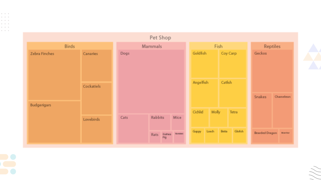
When to Use Treemaps
- Hierarchical data: Perfect for showing part-to-whole relationships in a hierarchy.
- Visualizing large datasets: Allows you to display complex data in a compact, easy-to-understand way.
Example Treemaps
- Sales revenue by product category and subcategory.
- Budget allocation across various projects.
11. Radar Charts
Radar charts, also known as spider charts, display data on a circular grid. Each axis represents a different variable, and the values are connected to form a shape.
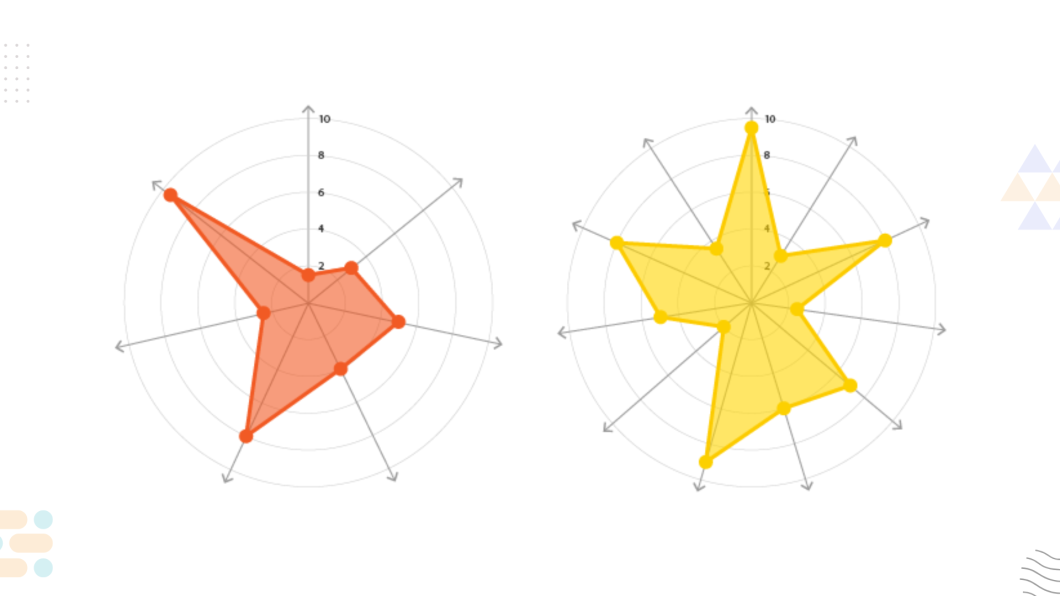
When to Use Radar Charts
- Multi-variable comparison: Ideal for comparing multiple variables across different categories, such as performance scores across multiple dimensions.
- Performance metrics: Often used in performance evaluations or competitive analysis.
Example Radar Charts
- Performance comparison across multiple teams or departments.
- Skill set analysis for employees.
12. Funnel Charts
Funnel charts are used to represent stages in a process, with each stage represented by a block that decreases in size, showing how values decrease as they move through the funnel.

When to Use Funnel Charts
- Process or conversion tracking: Perfect for showing stages in a conversion process or sales funnel.
- Identifying bottlenecks: Can highlight areas where values drop off or decrease.
Example Funnel Charts
- Conversion rates from website visits to sales.
- Stages in a recruitment process.
13. Box Plots (Box-and-Whisker Plots)
Box plots are used to visualize the distribution of a dataset, highlighting the median, quartiles, and potential outliers. They are particularly useful for identifying the spread of data.
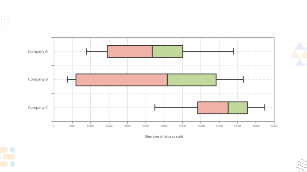
When to Use Box Plots
- Data distribution analysis: To understand the spread and variability of data.
- Outlier detection: Box plots help to identify outliers in a dataset.
Example Box Plots
- Exam scores distribution across a class.
- Variability in sales performance.
14. Waterfall Charts
Waterfall charts are used to visualize incremental changes in a value. They display how an initial value is affected by a series of positive or negative changes.
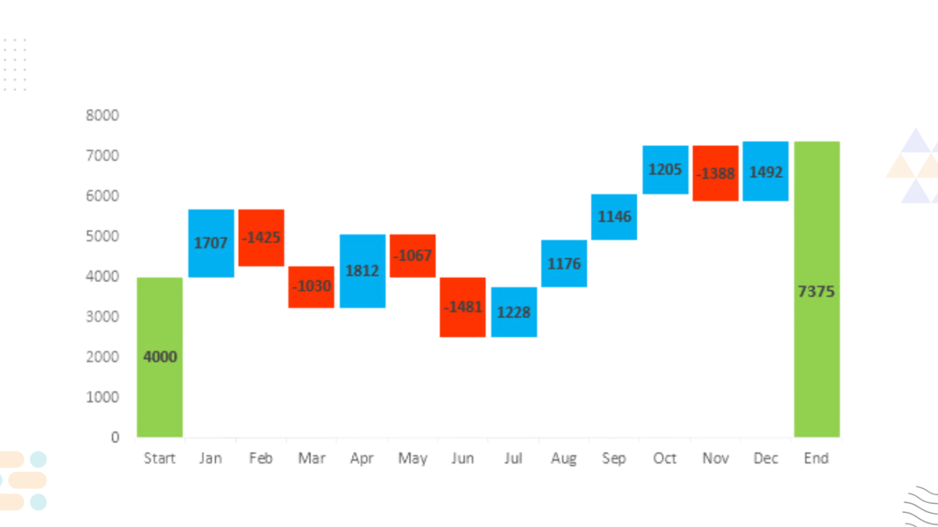
When to Use Waterfall Charts
- Visualizing step-by-step changes: Perfect for showing how a value is derived from different factors, such as profit changes.
- Financial analysis: Often used in financial statements to show changes in income or expenses.
Example Waterfall Charts
- Profit analysis showing revenue growth and expense deductions.
- Monthly revenue changes for a business.
Key Considerations When Choosing a Graph Type
1. Understanding Your Data
Before selecting a graph type, you need to fully understand the nature of your data. Is it continuous or categorical? Do you have a time dimension? Answering these questions will help guide your decision.
2. Audience and Presentation Context
Who will be viewing your data? The complexity of your visualization should align with your audience’s expertise. A simple graph may be more effective for a general audience, while a more complex one might suit analysts.
3. Purpose of the Visualization
Different graphs serve different purposes. Are you comparing categories, showing changes over time, or analyzing relationships? The goal of your analysis should dictate the graph type.
4. Simplicity vs. Complexity
Sometimes, less is more. Overcomplicating a graph with too many data points or elements can confuse viewers. Aim for simplicity without sacrificing the richness of the data.
5. Data Volume and Granularity
The size and granularity of your dataset will also influence your choice. Large datasets with many variables might require a more sophisticated graph, like a heatmap or network graph.
How to Choose the Right Data Visualization Graph for Your Needs
1. Start with Data Type
Data type is the first thing to consider when choosing a graph. Numerical data often works well with line graphs or histograms, while categorical data is best displayed with bar charts.
2. Match the Graph to Your Goal
Your visualization’s goal will guide you to the appropriate graph. If you’re showing trends, go for line graphs. If you want to show part-to-whole relationships, opt for pie charts.
3. Consider User Experience and Interpretation
Consider how your audience will interpret the graph. Make sure it’s clear and easy to understand at a glance, and ensure labels and legends are appropriately placed.
4. Choosing the Right Color Scheme
Colors play a critical role in data visualization. Choose a color palette that enhances readability and doesn’t overwhelm the data. Using too many colors can confuse the viewer.
Tools and Software for Creating Data Visualizations
1. Microsoft Excel and Google Sheets
For basic charts, both Excel and Google Sheets are excellent choices. They offer a wide variety of graph types and easy-to-use interfaces.
2. Data Visualization Software (Tableau, Power BI)
For more sophisticated data analysis, tools like Tableau and Power BI provide powerful features for creating interactive dashboards and more complex visualizations.
3. Python Libraries (Matplotlib, Seaborn, Plotly)
If you prefer coding, Python libraries like Matplotlib, Seaborn, and Plotly give you the flexibility to create custom visualizations that suit your needs.
4. D3.js for Advanced Web-Based Visualizations
D3.js is a JavaScript library that provides dynamic and interactive data visualizations for the web. It’s suitable for complex datasets and real-time updates.
Best Practices for Effective Data Visualization
1. Keep It Simple and Clear
The best data visualizations are straightforward and easy to interpret. Avoid cluttering the graph with unnecessary elements or too much text.
2. Use Consistent Formatting
Consistency is key. Use uniform colors, fonts, and labeling conventions to make your visualization easier to follow.
3. Label Data Clearly
Ensure that all axes, data points, and legends are clearly labeled. This will help your audience interpret the data without confusion.
4. Don’t Overcomplicate with Too Many Details
Keep the focus on the key points. If you add too many details, it can overwhelm the audience and dilute the message.
Conclusion: Choosing the Right Visualization
When it comes to choosing the best data visualization graph type for your data, it’s important to consider the nature of the data you are working with. Are you comparing categories, tracking trends over time, or showing the distribution of values? Each graph type offers its own strengths and weaknesses, so it’s essential to pick one that best communicates the story you want to tell.
In this article, we’ve covered over 30 different types of graphs, from bar charts to waterfall charts, each serving a specific purpose. By selecting the right one, you can ensure your data is presented in a clear, compelling way, enabling your audience to quickly grasp insights and make informed decisions.
FAQs: Common Questions About Data Visualization Graphs
1. What is the difference between a bar graph and a histogram?
Bar graphs are used to compare different categories, while histograms display the frequency distribution of continuous data.
2. Which graph type is best for showing trends over time?
Line graphs are ideal for visualizing trends over time, as they clearly show changes and patterns across periods.
3. When should I use a pie chart instead of a bar chart?
Use a pie chart when you need to show parts of a whole, and a bar chart when you’re comparing multiple categories.
4. How do I choose the right colors for my data visualization?
Choose colors that contrast well and are easy to differentiate. Avoid using too many colors, as this can create confusion.
5. Can I use more than one graph type in a single visualization?
Yes, combining multiple graph types in one visualization can be effective, especially if you’re showcasing different aspects of the data.
6. What is the best graph for large datasets?
Heat maps, scatter plots, and box plots are great for large datasets, as they can reveal patterns without overwhelming the viewer.